
Another project completed!
Static html site migrated to WordPress CMS and information architecture review and redesign to improve Google Adwords performance and conversions.
Two of the key reasons for poor Google Adwords performance, high PPC costs, and lack of conversions are: poor site design, and lack of clear, strong, call to actions. As part of this project we tackled both these problems.
The first stage of this project to review the existing site and identify the key elements that were preventing conversion. Our go to tool for this sort of analysis is HotJar. HotJar is a great tool that provides click streams, video, and heat maps of the way users interact with your site. It provides real data that can be used to suggest and validate areas that need to be changed to improve the user experience.
In this case one of the biggest problems we identified was the that Adwords links were linking to bookmarks within a quite text heavy page. Each campaign was directing the user to a different segment of the page, often two to three view ports down from the top of the page. Users were landing on pages that were devoid of any business branding, identify, navigation or location information.
The image below shows an example of one of the pages before and after.
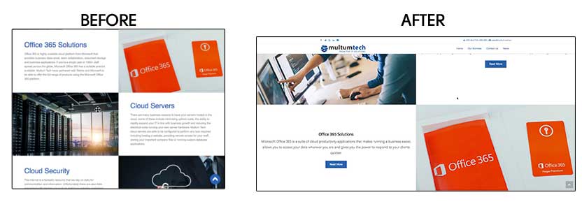
In user testing we often refer to a trunk test and the importance of users landing on a page other than the home page being able to quickly identify: what site they are on, where they are in the overall site structure, and what their next steps or actions should be from this page; In this case we found the Adwords landing pages were failing the trunk test, users were confused and were bouncing off the site.
Something as simple as a sticky header and navigation helps to ensure consistent branding across all devices and pages increasing user retention.
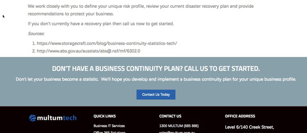
We also identified that the existing site lacked a clear information architecture resulting in unclear, generic, or weak calls to action. This was largely addressed by separating the text heavy pages into their smaller focussed pages and logically grouping service offerings and benefits into separate areas. Separating the pages meant that calls to action could become far more targeted to the content of the page and much stronger.
The image below is an example of a much more targeted call to action in a page body.
Finally by developing a clear information architecture and breaking up the content we were able to make effective use of the page headers by including hero images with strong, and relevant, call to actions. Our video analytics and heat maps had found users consistently were clicking on elements of the existing header images expecting something to happen, but nothing was.
In this case we went from weak, generic hero images like the below.

To much stronger hero images after the development like this one.

Taking time to understand your information architecture and to develop strong, unique call to actions are both vital elements of website design and development. If your website has 1,000 pages or 10 pages information architecture and the resulting calls to action is what will lead a user to take action. Poor conversion rates will always mean that one of these two is broken; either you have not understood the information your users are looking for, or you have not clearly communicated what they need to do next.